Widget Layout, Sizing and Positioning
Each widget has several builder setter methods for position and size. They all come from the IPositioned interface.
Coordinate system
- Widget coordinates are local to the widget; (0, 0) is the top-left corner of the widget.
- Positions are relative to the parent by default.
Sizing
width(int)sets the widget width in pixelswidthRel(float)sets the widget width relative to its parent (e.g. if the parent is 120 px wide and we callwidthRel(0.5f), our widget will be 60 px wide)height(int)andheightRel(float)work analogous to previous methodssize(int width, int height)is equivalent to.width(width).height(height)size(int val)is equivalent to.width(val).height(val)sizeRel(float width, float height)andsizeRel(float val)work analogous to previous methodsfullWidth()andfullHeight()are shortcuts forwidthRel(1f)andheightRel(1f)respectivelyfull()combines the previous two methodscoverChildrenWidth()makes the widget width wrap tightly around its childrencoverChildrenHeight()works analogous to previous methodcoverChildren()wraps width and height tightlyexpanded()is only useful for children ofRowandColumnwidgets. It will make the widget expand as much as possible in the widgets axis (width in row and height in column)
Positioning
We can set position on four different points, two for each axis. left(), right(), top() and bottom().
To understand what they are doing take a look at the following picture:
As you can see the methods are fairly self-explanatory. Each of those methods has multiple variants much like width()
and widthRel(). Only methods for left() will be listed here.
left(int x)sets the x position in pixels relative to its parentleftRel(float x)sets the x position relative to its parent (f.e. 0.5f will center the widget)leftRelOffset(float val, int offset)is the same asleftRel(float x), but also adds anoffsetin pixels after the calculationleftRelAnchor(float val, float anchor)is the same asleftRel(float x), but with a different anchor (see Anchor)leftRel(float val, int offset, float anchor)combinesleftRelOffset()andleftRelAnchor()left(DoubleSupplier val, Measure measure)is likeleft()andleftRel(), but with a dynamic value. Note that the supplier is only evaluated during resizing. You can't use it for animating widgets.leftRelOffset(DoubleSupplier val, int offset)is likeleftRelOffset(float val, int offset)with a dynamic valueleftRelAnchor(DoubleSupplier val, float anchor)is likeleftRelAnchor(float val, float anchor)with a dynamic valueleftRel(DoubleSupplier val, int offset, float anchor)combines the two methods above
All the above variants also exist for right(), top() and bottom().
Additionally, there is
pos(int x, int y)combinesleft(int x)andtop(int y)posRel(float x, float y)combinesleftRel(float x)andtopRel(float y)alignX(float x)is short forleftRelAnchor(x, x)alignY(float y)is short fortopRelAnchor(y, y)align(Alignment a)combinesalignX(float x)andalignY(float y)center()is short foralign(Alignment.Center)
Anchor
The anchor is the point of the widget at which the widget will be positioned with the relative value. The following
picture should make this clear. In the picture leftRelAnchor(0.5f, 0.3f) is called.
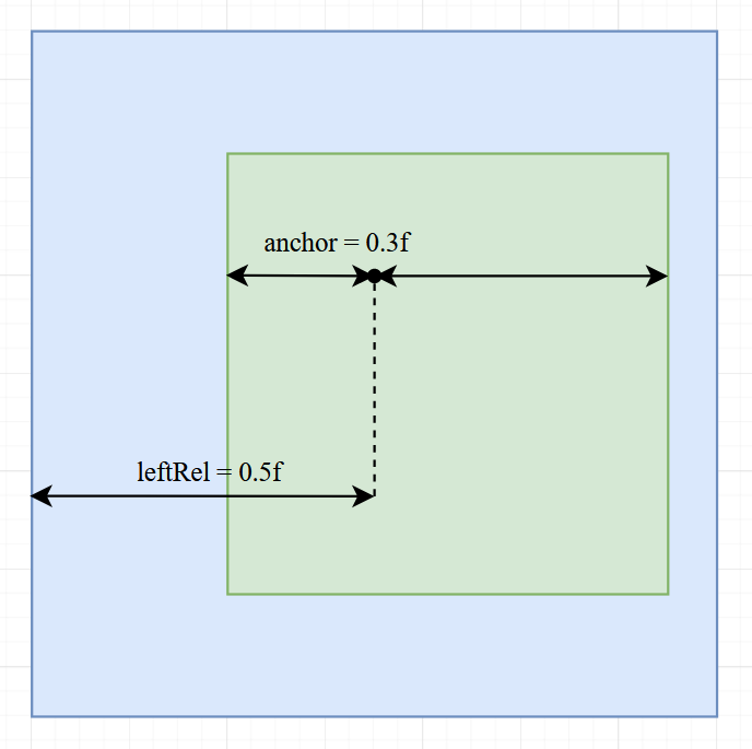
Here the anchor is placed at 0.3f, which is about a third of the widget.
And that anchor is positioned at 0.5f of the parent widget (the center).
Try imagining what happens with different anchor values and play around with it by yourself.
If we had called leftRel(float val, int offset, float anchor), then the offset would be added after the anchor
and relative position calculation.
Combining Size and Position
You can call multiple different position and size methods, but you should be aware of its effects and limitations.
Each axis (x and y) has three setters (x has left(), right() and width(), y has top(), bottom() and height())
without including all the variations.
Note
You can call at most two setters for each axis, since with two properties set the last one can always be calculated.
For example of you call left() and right() then the width can be calculated with right - left.
Setting all three properties for an axis will remove one of the other properties and log an info message.
Note
By default, the position is (0, 0) and the size is 18x18 in pixels for most widgets.
Changing the relative Parent
By default, the size and position are calculated relative to the widget's parent, but that can be changed with
relative(Area), relative(IGuiElement) and relativeToScreen().
The parent of all panels is by default the screen.
Warning
Changing the relative widget might cause some unexpected results in some edge cases. Please notify us if you run into one of those.
Flow layout (Row / Column)
Flow is the core layout widget for arranging children along one axis.
Flow.row()lays out children left-to-right (X axis).Flow.column()lays out children top-to-bottom (Y axis).mainAxisAlignment(...)controls how children are distributed on the main axis:START,CENTER,END,SPACE_BETWEEN,SPACE_AROUND- e.g.
Flow.row().mainAxisAlignment(Alignment.MainAxis.CENTER)centers the row's children horizontally, given that it has a set width
crossAxisAlignment(...)controls alignment on the perpendicular axis:START,CENTER,END- e.g.
Flow.row().crossAxisAlignment(Alignment.CrossAxis.CENTER)centers the row's children vertically, given that it has a set height
childPadding(int)adds fixed spacing between children.coverChildren()/coverChildrenWidth()/coverChildrenHeight()sizes the flow to fit its children.collapseDisabledChild()does not consider disabled children during position calculations.- This is useful when the enabled state of children changes dynamically.
reverseLayout(bool)reverses the order that children are drawn.
Notes:
- Centering (main or cross axis) requires the flow to have a known size on that axis. If you want a row to center its children horizontally, give it a width (e.g.
widthRel(1f)orwidth(120)). - By default, a
Flowisfull(), which means they take up as much space as their parents size.
Here is how all the MainAxisAlignments apply to widgets:

Centering widgets
There are two common ways to center things:
1) Center a widget within its parent (positioning)
widget.center()orwidget.align(Alignment.Center)widget.horizontalCenter()orwidget.verticalCenter()
2) Center children inside a Row/Column (layout)
Flow.row().mainAxisAlignment(Alignment.MainAxis.CENTER)centers children along the flow's direction.Flow.column().crossAxisAlignment(Alignment.CrossAxis.CENTER)centers children perpendicular to the flow's direction.- Remember to give the row/column a size on that axis (e.g.
widthRel(1f)for a row).
Margin vs padding
Spacing is handled via two different concepts:
- Margin: space outside a widget. Layouts (like
Flow) include margins when positioning children.marginTop(px),marginBottom(px),marginLeft(px),marginRight(px)set the padding in pixels for the directionsmargin(all),margin(horizontal, vertical),margin(left, right, top, bottom)are shortcuts for the respective methods
- Padding: space inside a widget. It reduces the content area and affects how children are placed.
paddingTop(px),paddingBottom(px),paddingLeft(px),paddingRight(px)sets the margin in pixels for the directionspadding(all),padding(horizontal, vertical),padding(left, right, top, bottom)are shortcuts for the respective methods
Examples
Simple centered panel with a row of buttons
ModularPanel panel = new ModularPanel("example")
        .size(176, 168);

panel.child(new ParentWidget<>()
        .size(90, 63)
        .align(Alignment.CENTER)
        .child(Flow.row()
                .coverChildren()
                .childPadding(4)
                .child(new ButtonWidget<>().size(16))
                .child(new ButtonWidget<>().size(16))
                .child(new ButtonWidget<>().size(16))));
Column with padding and left-aligned content
Flow column = Flow.column()
        .widthRel(1f)
        .padding(10)
        .crossAxisAlignment(Alignment.CrossAxis.START)
        .child(new TextWidget<>(IKey.str("Title")).marginBottom(4))
        .child(new TextWidget<>(IKey.str("Body")));